Context:
This redesign is done for one of the in-house products I have worked with. The Product features a mobile app focusing on employee engagement. As it evolved, it needs a web platform to facilitate managing of content and users by HQ departments.
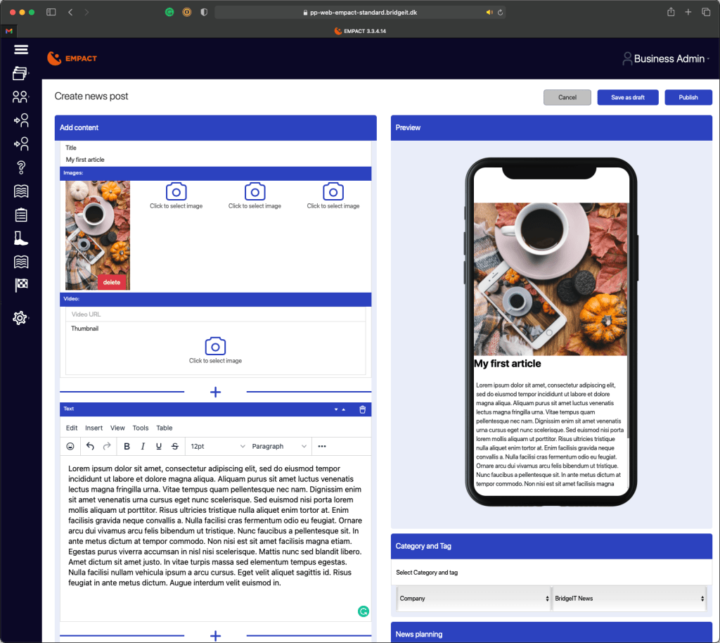
The web admin has been quickly created by the development team with little UX and UI input due to various reasons.
In this post I will present my approach to the web admin from a product design perspective – which I have actively worked on pushing with the organisation.
Problem statement – overall scope of the platform
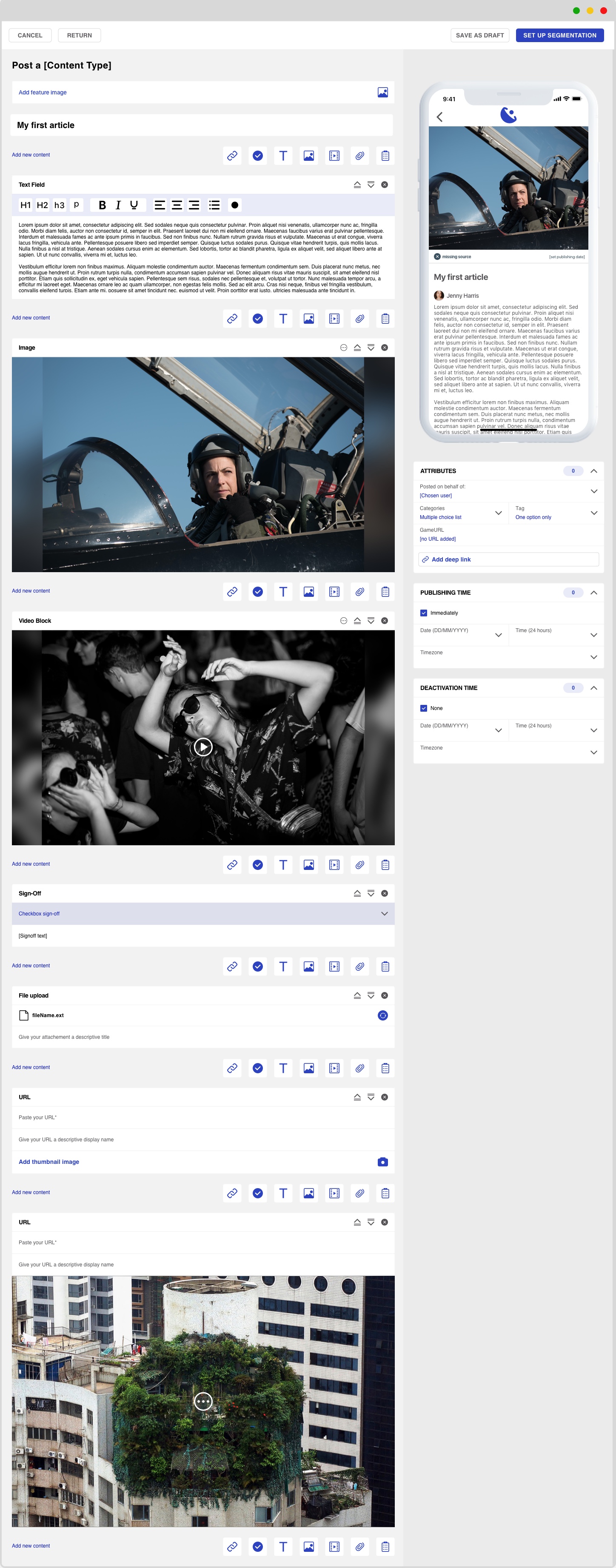
Design a web platform that will allow the user to create content, distribute and manage content.
- Provide an interface that will merge and imitate tools the users are already using in their current process (Word, PowerPoint, Facebook and Sharepoint)
- design content blocks that enable adding a variety of elements to the article
- ensure a unified and consisted flow for creating any type of content within the entire platform
Current implementation: short description
The current implementation has been driven by necessity and time pressure. It has provided a temporary rough solution to the following requests:
- freedom for content creation
- multiple types of content blocks
- in-between content insertion
- content reordering
Redesign targets: problem and argument for redesign
The product presents a heavy UI with no clear focus point.
This blocks the user from focusing on their task of creating content by not allowing them to see content clearly due to the heavy focus on containers. This will cause the user to not use the product as intended, as it doesn’t provide the necessary support for them to successfully complete their task.
As this is a work tool, they must to use it, leading to a drop in productivity, work quality and overall work life cause by frustration and confusion in using the tool which proves unable to provide the necessary support in fulfilling the task.
A poorly designed must-have can do more harm than good, while a well designed nice-to-have can bring unexpected profits to one’s workflow.

Redesign targets: problem and argument for redesign
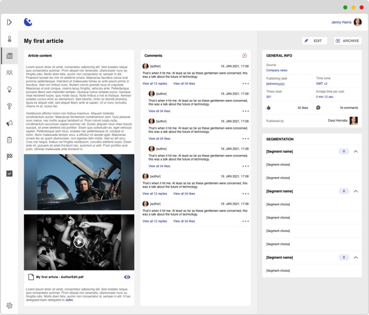
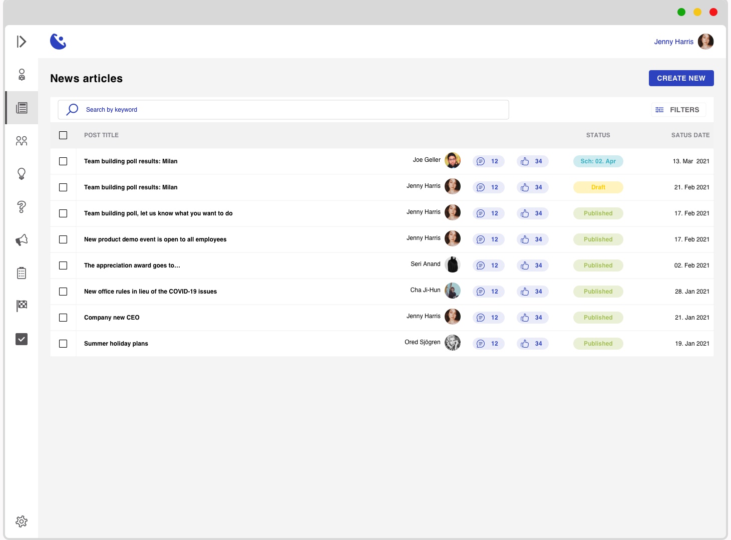
The overview list is unstructured and presents irrelevant information
The purpose of making a list of created articles available to the user has been achieved with the current implementation.
From a UX and UI point of view however, this function is lacking in terms of providing clear and relevant information. It currently presents non-priority information.
A overview should accentuate the high priority information, that helps the user get a grasp of the article’s interaction level or/and data gathered. In this way, the user will be able to identify articles of outstanding importance to them so they can investigate further
Redesign targets: problem and argument for redesign
The articles always open in edit mode
As this can be considered an easy way of editing mistakes in articles, the User Journey indicates that the case of editing an article is not a reoccurring action once the article is published. Instead needing to monitor the article and the interaction with it.
User journey as discussed with stakeholders/potential users:
- HQ needs to send new information to their lower level employees
- a content creator user will start writing a draft
- the draft is now ready to be published
- the content creator publishes the article to the relevant user groups (using another separate function not described here)
- the content creator and/or monitor review the article regularly to see if any outstanding comments have been added and generally see how the interaction with the article is proceeding in order to improve future content.
The redesigns: UI and UX improvements
The product presents a heavy UI with no clear focus point.
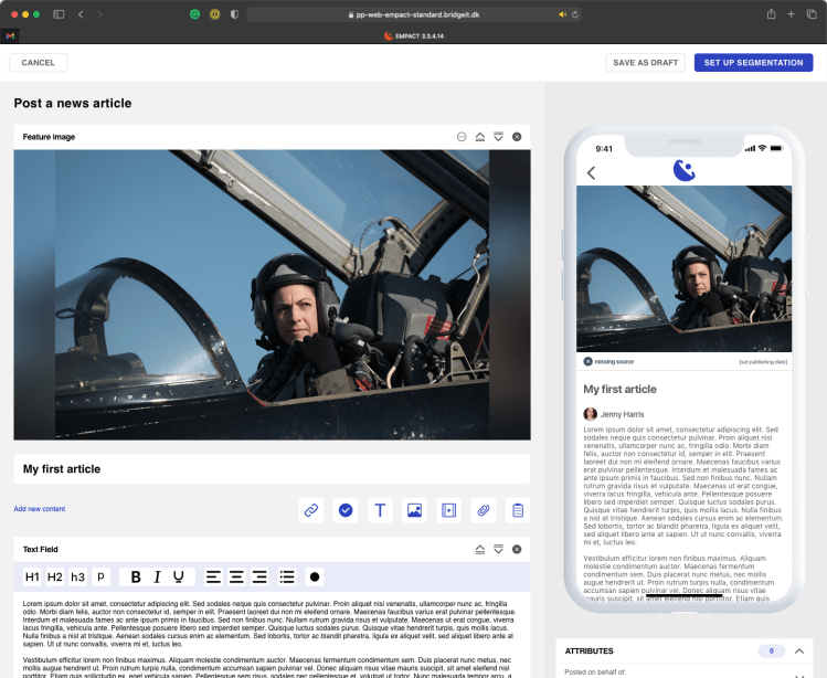
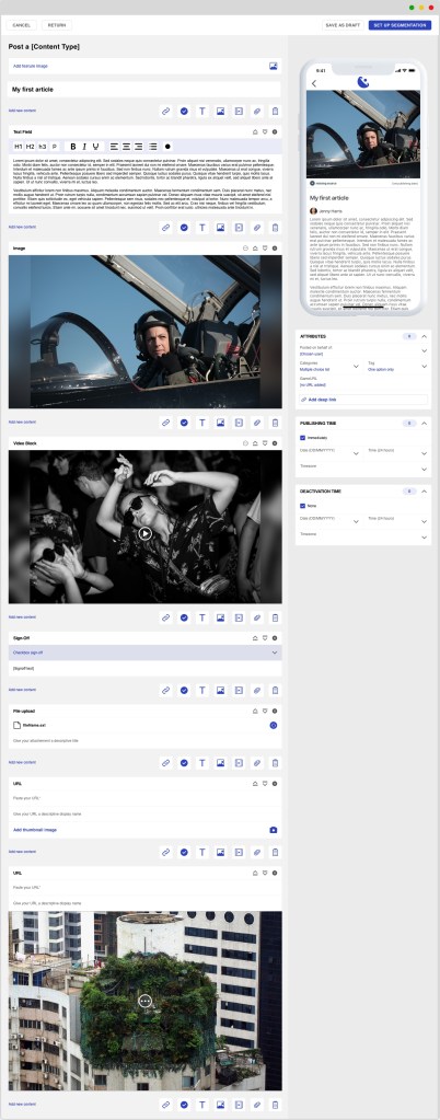
For the redesign of the UI, I have focused on making the platform as clean as possible, resembling a clear sheet of paper. This is a relatively obvious solution. It is used for many creation oriented digital products as it is the base for starting a project in the analogue world
When design I look into the current process of the user in achieving the task that needs to be solved with the new digital product.
In this way I can ensure that the user will have an easier time adapting to the digital product and use it with more ease. The product becomes more intuitive for them as they are familiar with the overall flow.
Further on, I improve the UX of adding content by displaying the options on the creation page instead of having them hidden under a plus button. The create function is in between each block to enable a flexible creation flow.
The building blocks are clean and present clear editing, reordering and deletion options.
The redesigns: UI and UX improvements
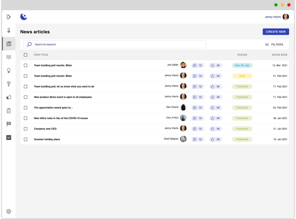
The overview list is unstructured and presents irrelevant information
The list becomes cleaner by removing all the colouring, focusing on white with a CTA colour.
I focus on the most differentiating information to be displayed in the list:
- article title
- author
- number of received reactions (likes and comments)
- status of article (published, draft, archived)
- date at which the displayed status has been given
In this way the user can easily find what they are looking for.
Towards this goal, the interface also present a key-word search, which would search in the title and content. And in addition, there is also a filter option, where a more advanced funnelling of content can be done depending on different parameters not yet defined with stakeholders.
The redesigns: UI and UX improvements
The articles always open in edit mode
User journey as discussed with stakeholders/potential users:
- HQ needs to send new information to their lower level employees
- a content creator user will start writing a draft
- the draft is now ready to be published
- the content creator publishes the article to the relevant user groups (using another separate function not described here)
- the content creator and/or monitor review the article regularly to see if any outstanding comments have been added and generally see how the interaction with the article is proceeding in order to improve future content.
To support the user journey, conditions on what should be displayed when should be created. This UX will enable the user to have the most relevant action triggered for the current status of the article. Therefore:
- published articles: will open a details page showing the article, comments from users and other meta data
- drafts and scheduled articles: open in edit mode as they can still be a work in progress, and the creation flow is not considered completed until the article is live