Context:
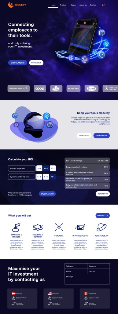
Based on a logo design for the same brand, a rebrand of the website was needed. Given the name – Empact – and the concept of the logo, I came up with a space theme where the product is the planet around which all systems used by employees in their day-to-day work are orbiting moons.
The target group was a particular one: data analysts, 50-60 y/o, who were set in their ways. So getting them on board with accepting a new interface and a new way of displaying the data was challenging.
The design strives to display the fluctuation or stability in the current inventory usage in a graphical way, using data visualisation.
The design
Home page
When I conceptualised the new website design, I wanted to reach two goals:
- make an impression
- provide a understanding of our product without revealing too much
Towards this goal I have used a metaphor:
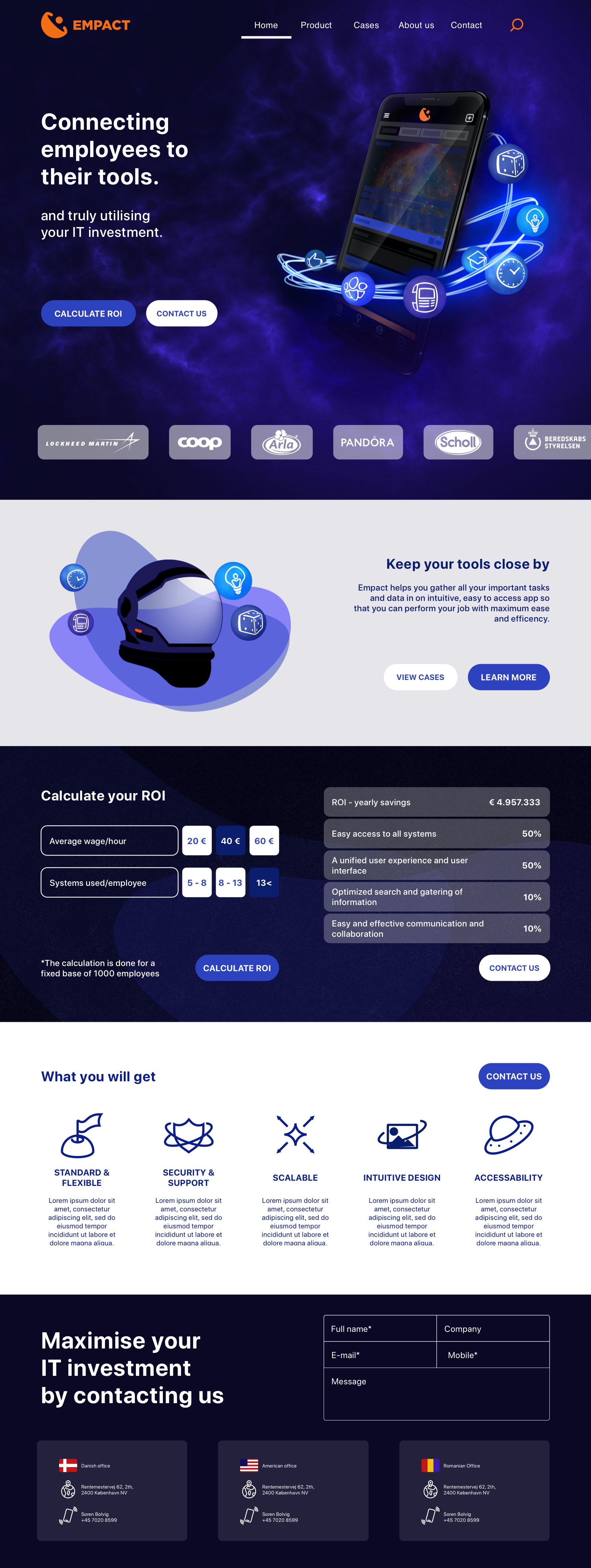
in a vast universe of tools and products, Empact integrate all together into one compact nicely packaged app, having them at your fingertips, anytime, anywhere.
Therefore, the app being the planet and the systems the moons orbiting around it.
I wanted the user to be intrigued, and continue navigating our website to learn more about the product, into our cases and product description page.
Check out the animation which would have looped in the second section:


The design
Product page
Check up the animation which would loop on the page:
“The Empact platform structure”
I aimed at describing the types of clients we collaborate with, by splitting them on industry, redirecting the user to concrete cases showcasing our competencies.
Further on I focused on creating a visual representation explain gin our platform.
Animation are able to convey messages in a more effective and structured way than static images. Combining these with text gets the point across.
In the end, after the user has been convinced to put in the effort of studying the product more in depth, I provide an interactive section, miming our most used functionality, by allowing the user to pick and choose what they want to read on in the “Popular Empact functionality” section.
These are also split up into industry types, to ensure that we focus on the user and their needs without wasting their time through pointless scrolling through information that isn’t relevant to them.
Mockups


