
Context:
Within a large organisation where teams are divided per functionality in different departments, it is important to have a solid foundation that would ensure a unified experience for the user. This focuses on navigation principles, assuring consistency in the interaction, screen templates and design system.
Problem statement – overall scope of the platform
The task is remaking an already existing system.
Knowing what the system contains, links and functionality, modernise and redesign the platform to fulfil the user’s current needs. To achieve this, all teams need to be engaged and agree on a common approach.
As channel lead – the leading team deciding the direction of the platform – analyse the current structure, navigation and functionality and provide a solid foundation containing:
- navigation principles
- interaction rules
- page types and layout templates
- representative and staple UI elements for the platform
Research, conceptualising and discovery
The process started with a large workshop including both channel owners and representative members of the teams handling the functionality.
Once a main approach was chosen, myself and 2 other designers started collaborating on the foundation direction. This work was preliminary to one individual taking ownership of the project so that we tailor out an agreed concept before any focused work.
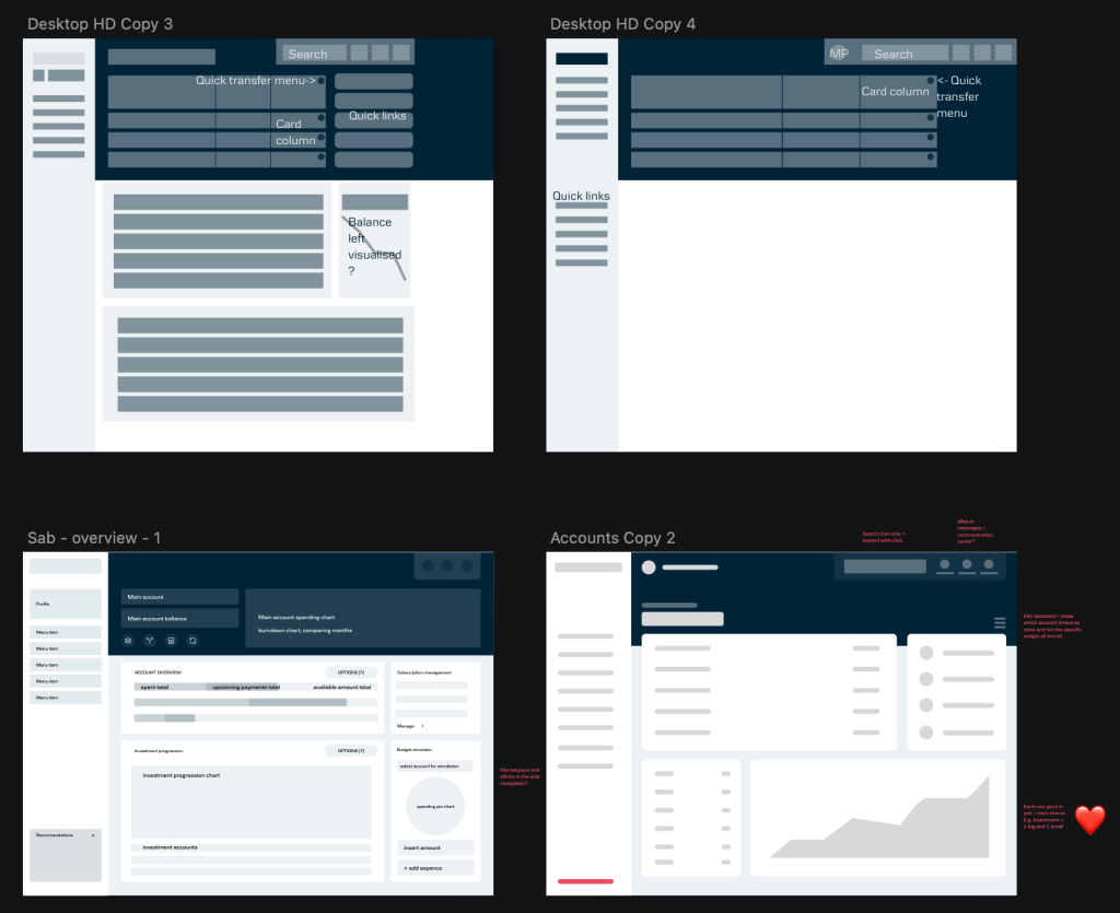
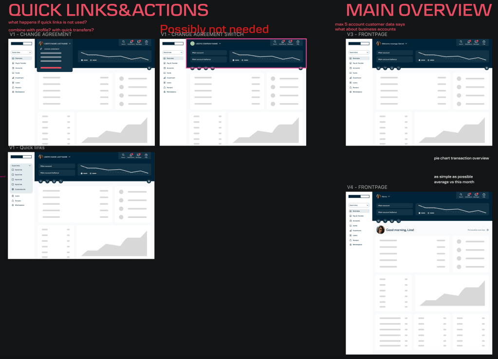
Focus was on the navigation, functionality structure and the overview screen. These decisions were based on our customer personas and their needs, wants and pains.
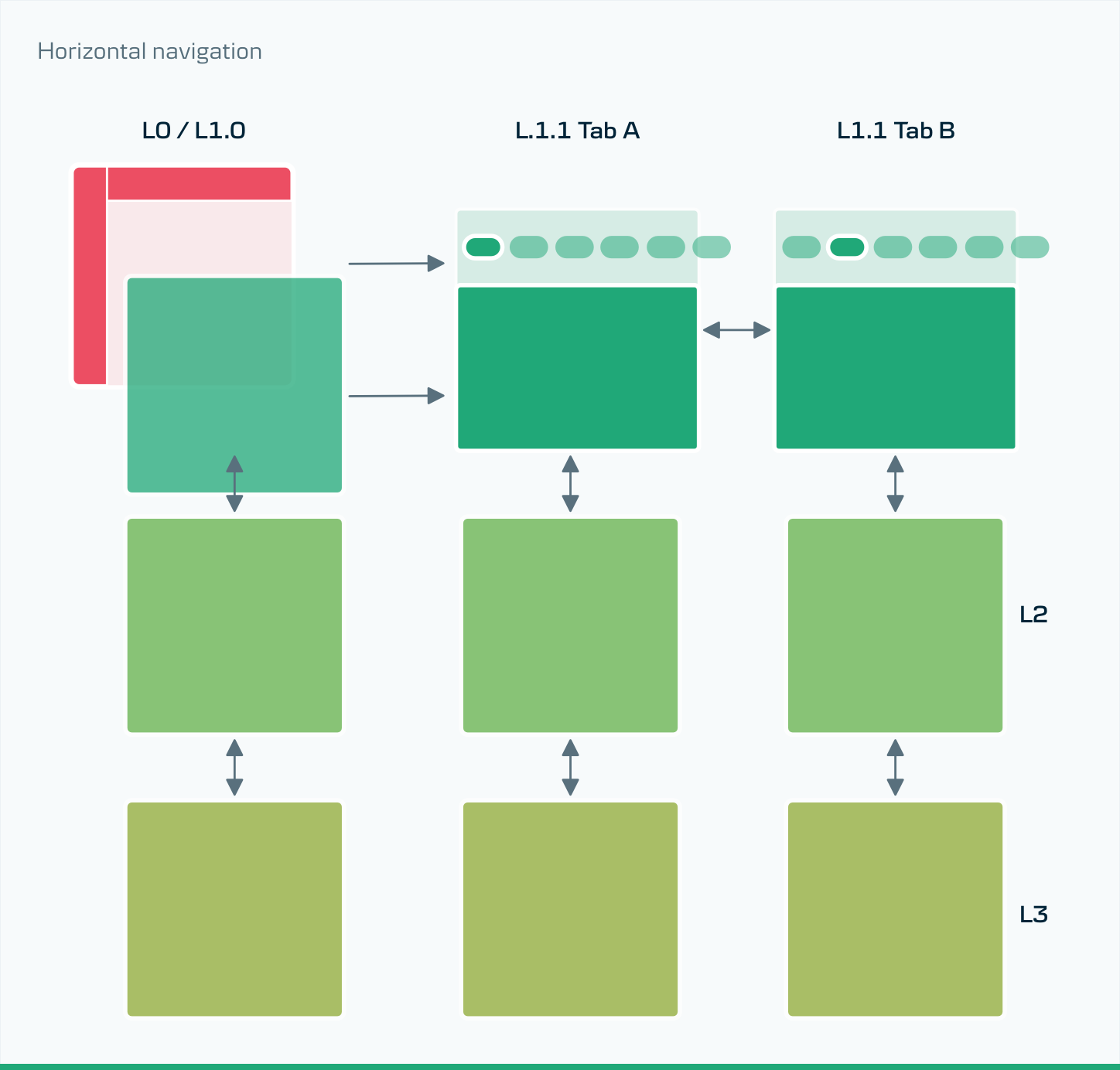
The structure is based on how the customer is expected to use each function.
I focused on providing content before they need to ask for it. Using the knowledge we gather form CX interviews and personas, I wanted to create a platform where the customers get all their most needed information just by logging in. Followed then by targeted navigation deeper into a specific context. The navigation is limited to 3 levels protecting the user form the desktop rabbit whole from hell.
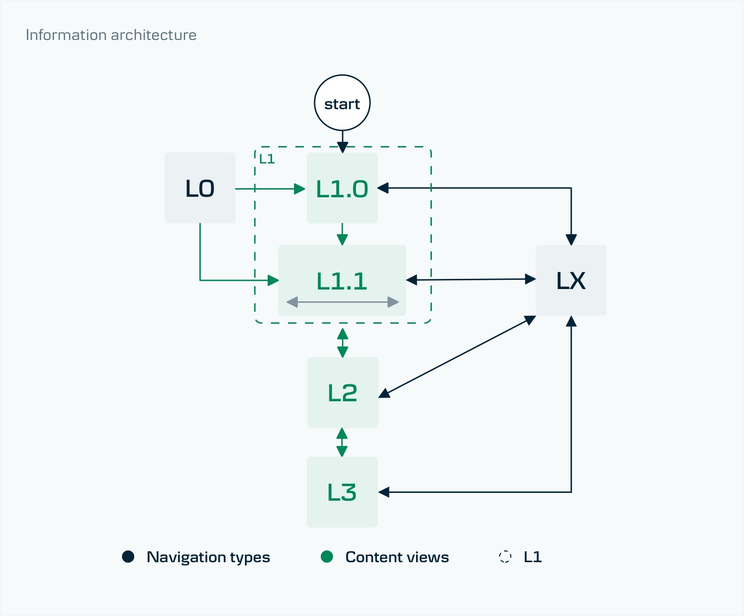
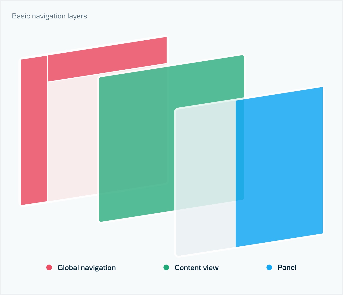
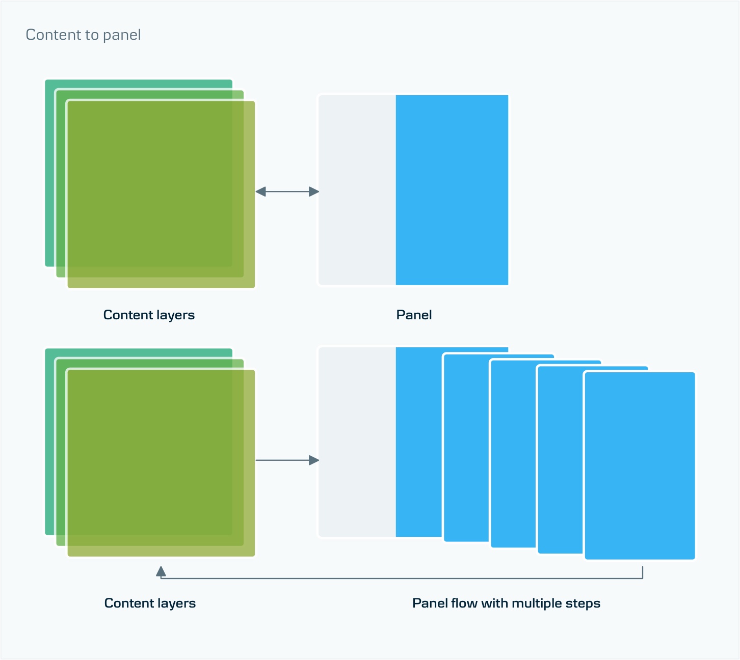
Editing and user input is conducted on a top level overlayed on the original context. I didn’t want to take the user out of the context when needing to execute a flow because it seemed to break the overall experience for too little reward. The flows in the platform are minimal, simple transactions, inputs and selections. Any flow that is more complex needs to be conducted in an isolated space, to allow for focus and immersion. A template and guidelines should be defined for this.
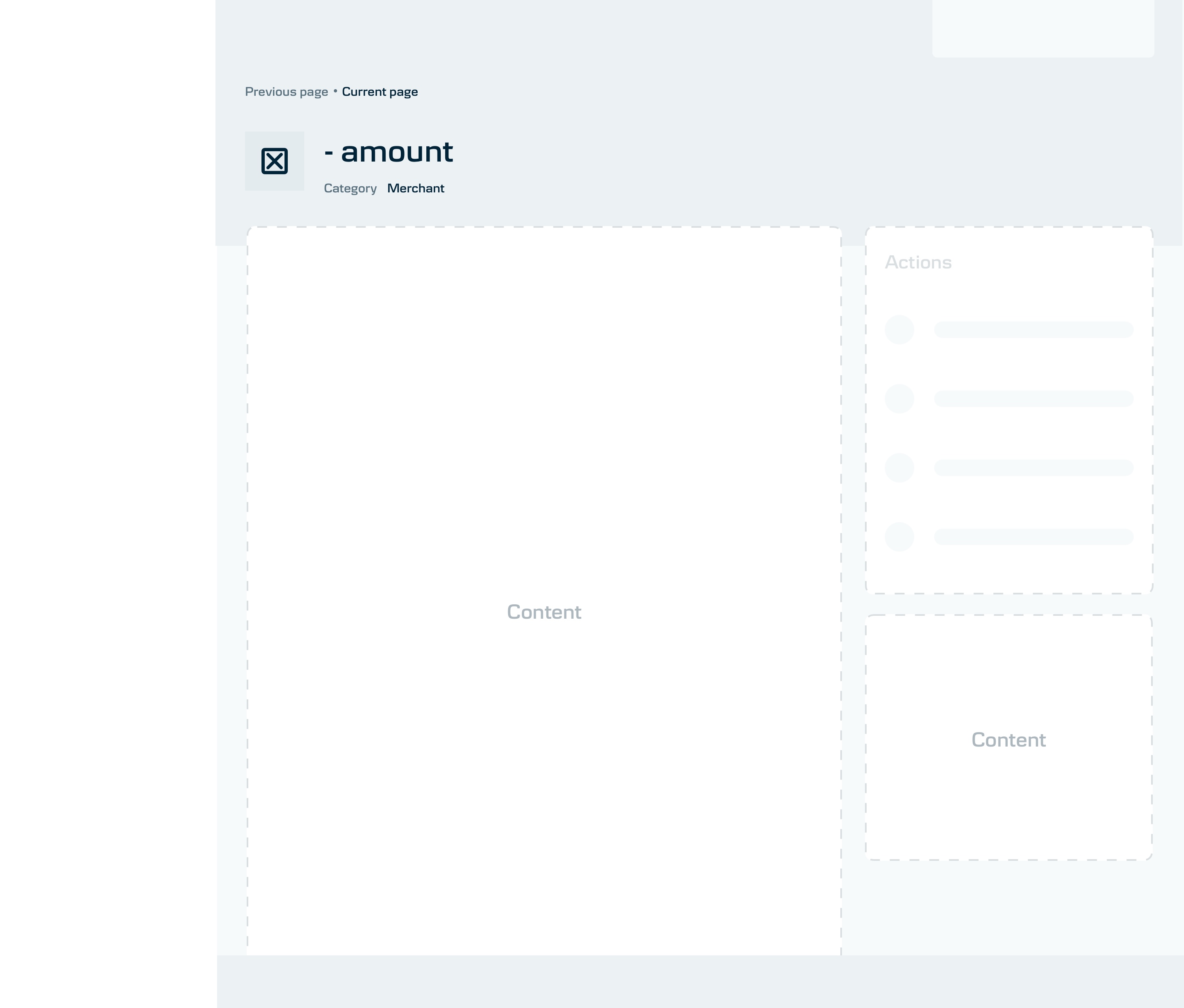
The templates
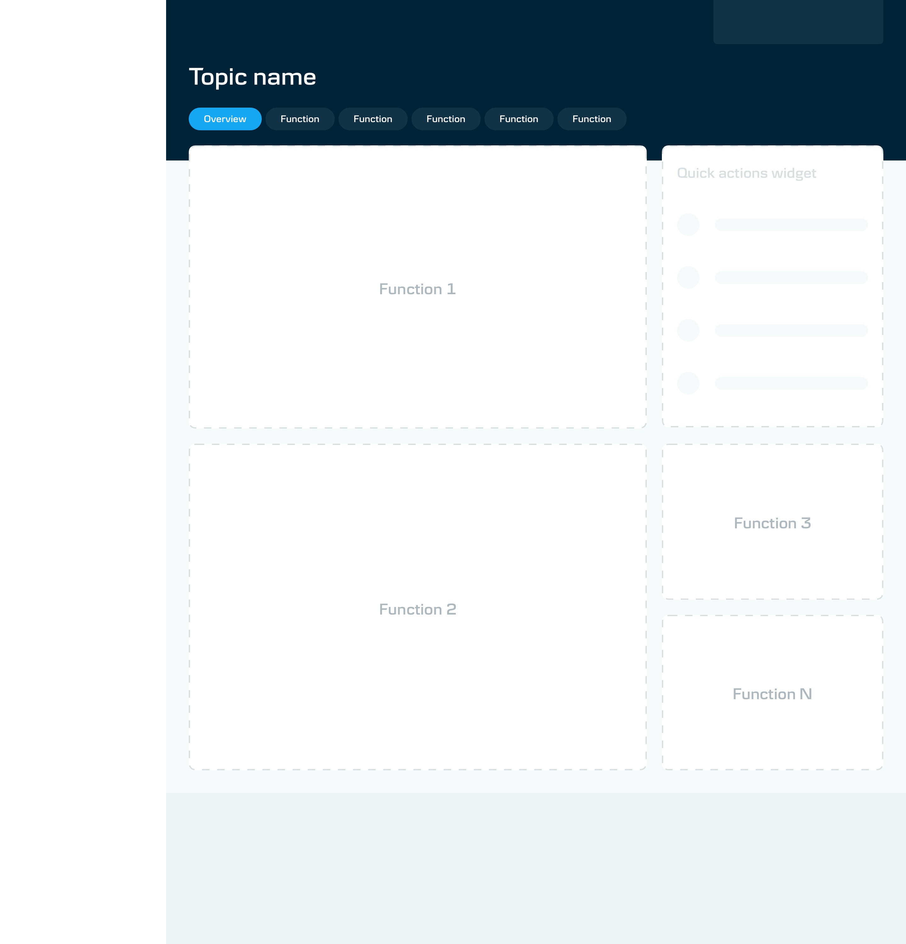
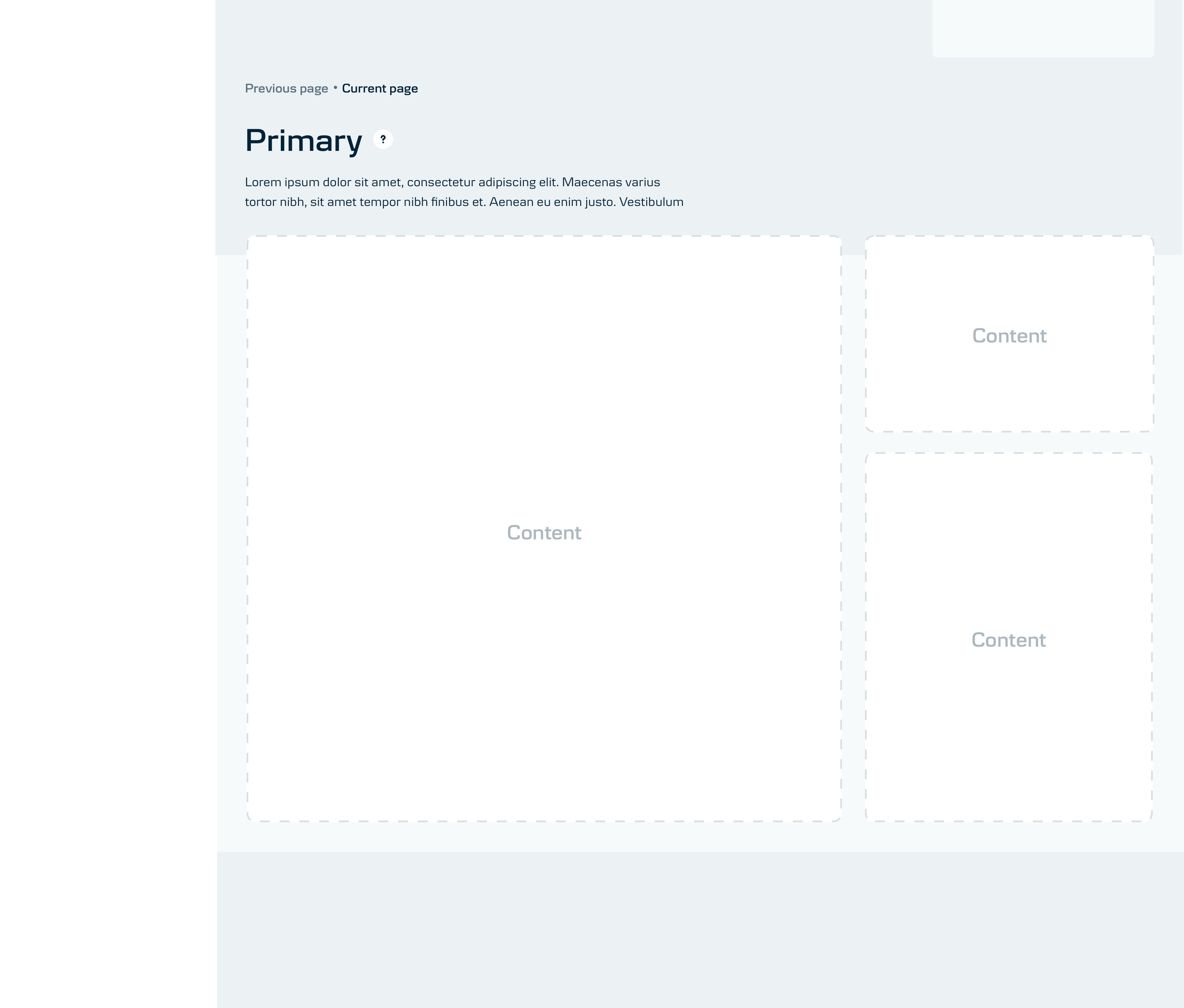
Layouts to be respected when adding new functionality
Each content layer has a specific layout.
It isn’t only about the content split but also the general UI specs to support the hierarchy.
Navigation takes priority focusing on transparency and shallow depth.
To tie in into the brand as well as into a hierarchical rule, colour theming is used.
Designs examples
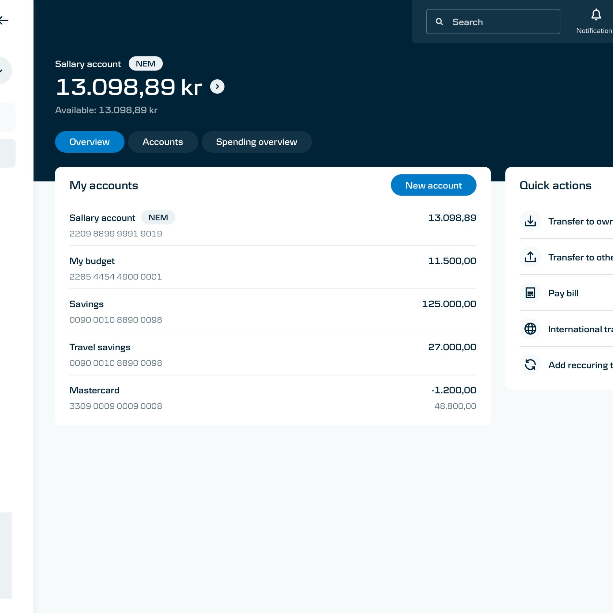
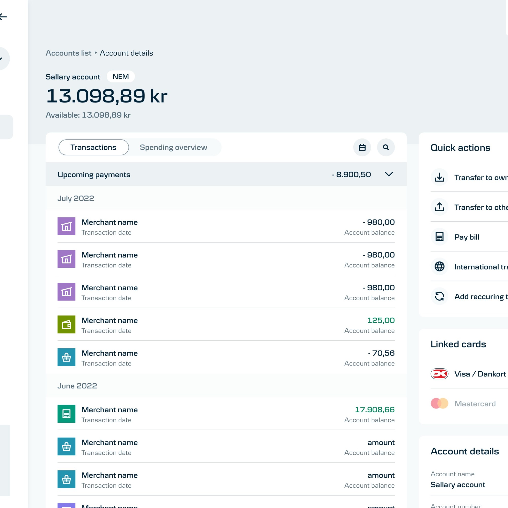
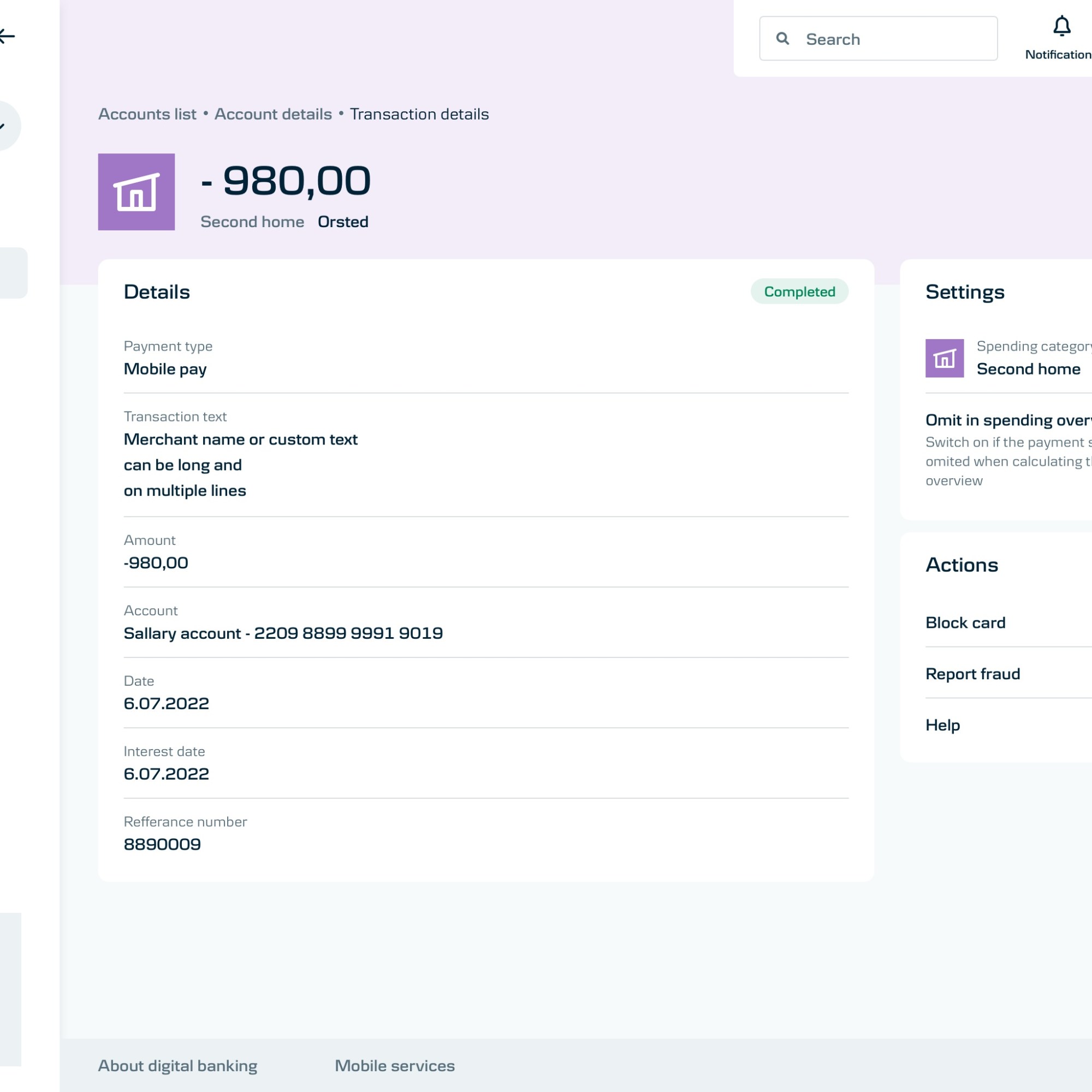
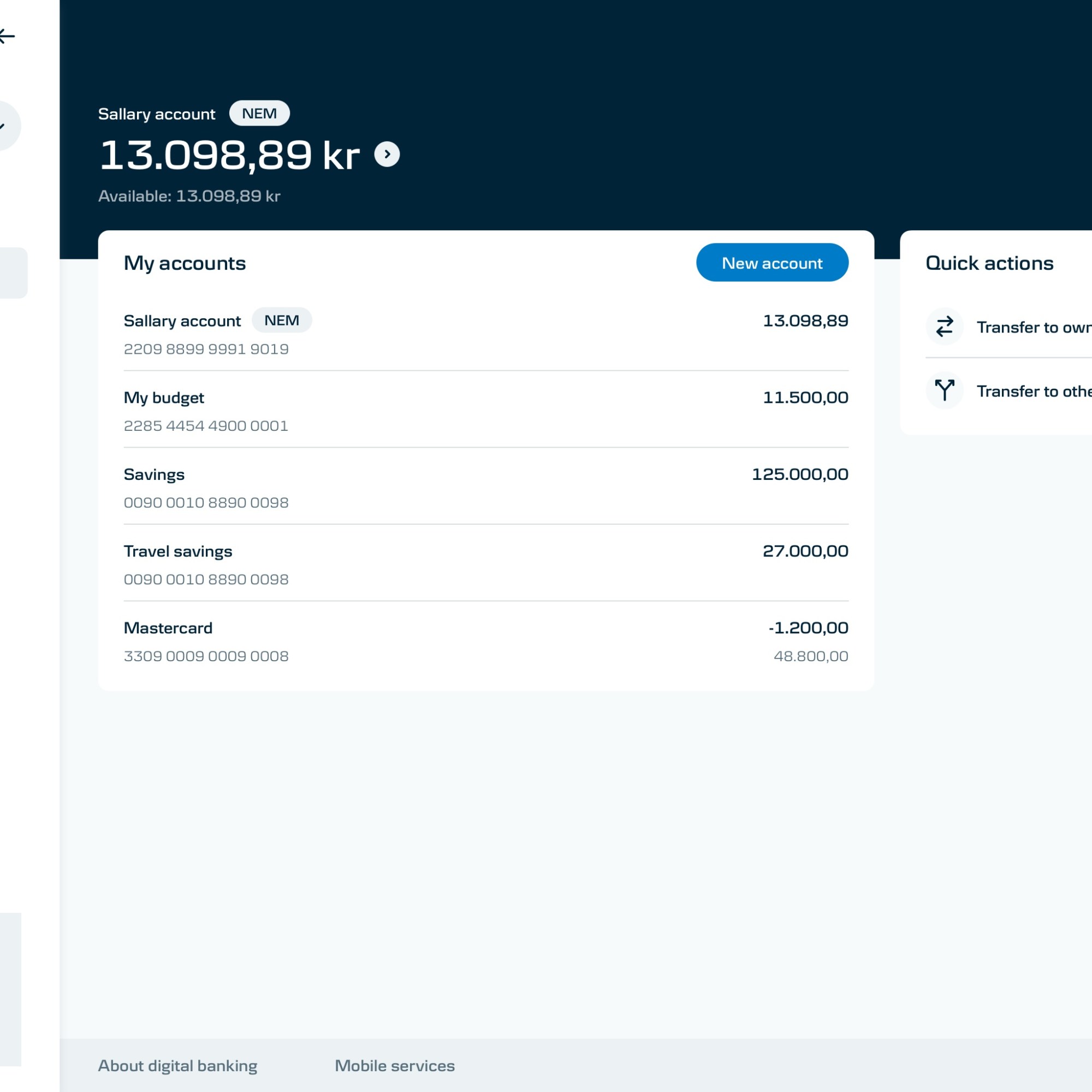
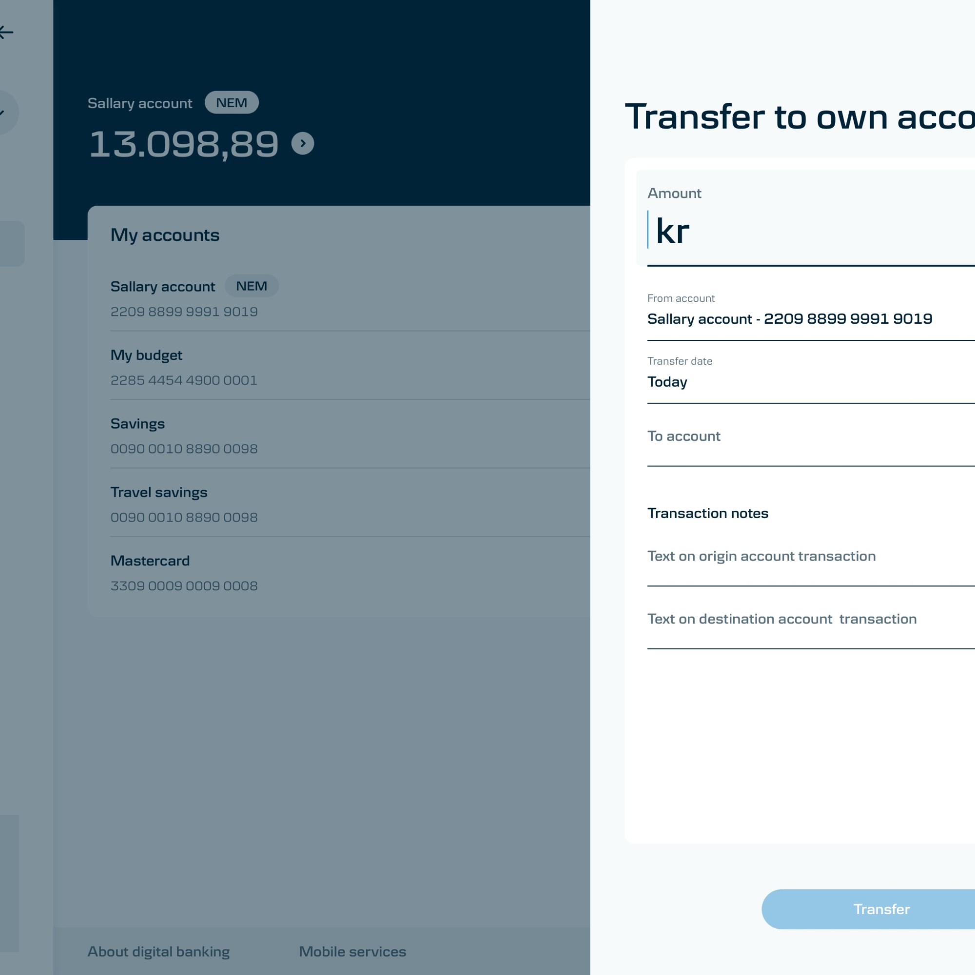
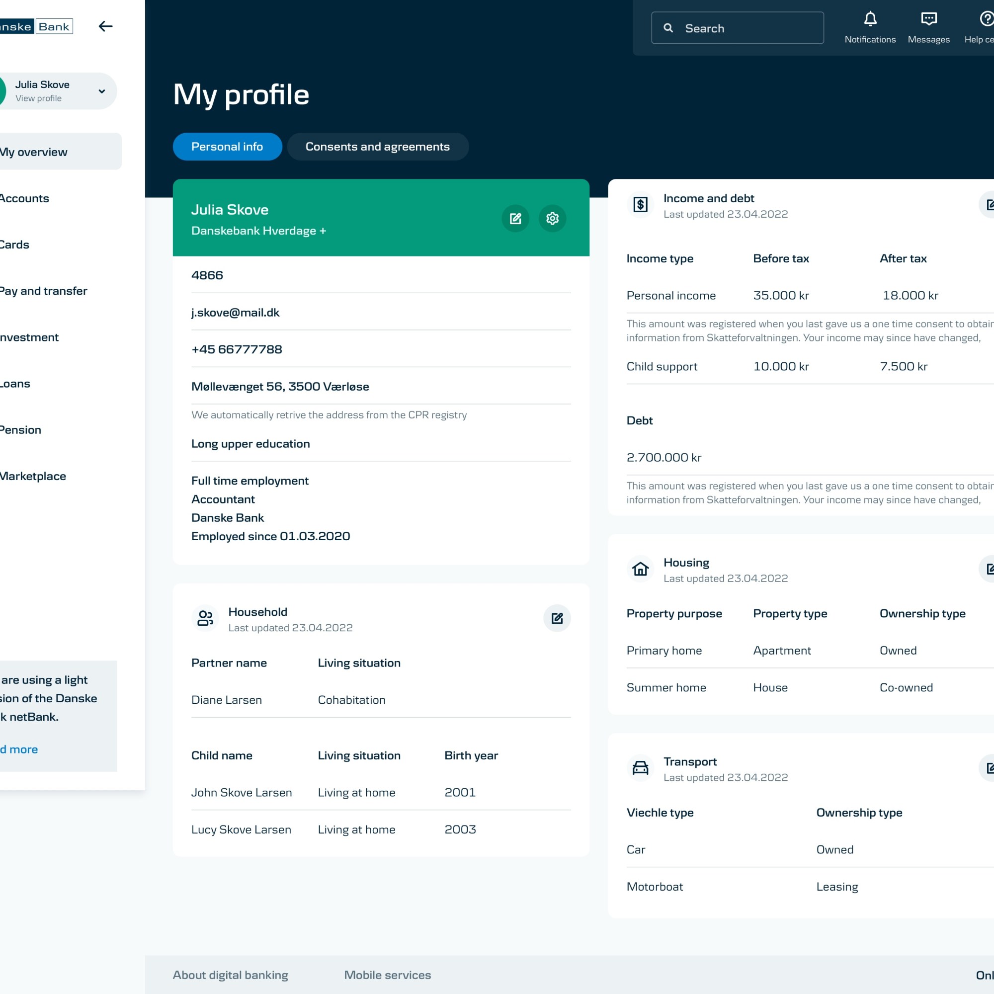
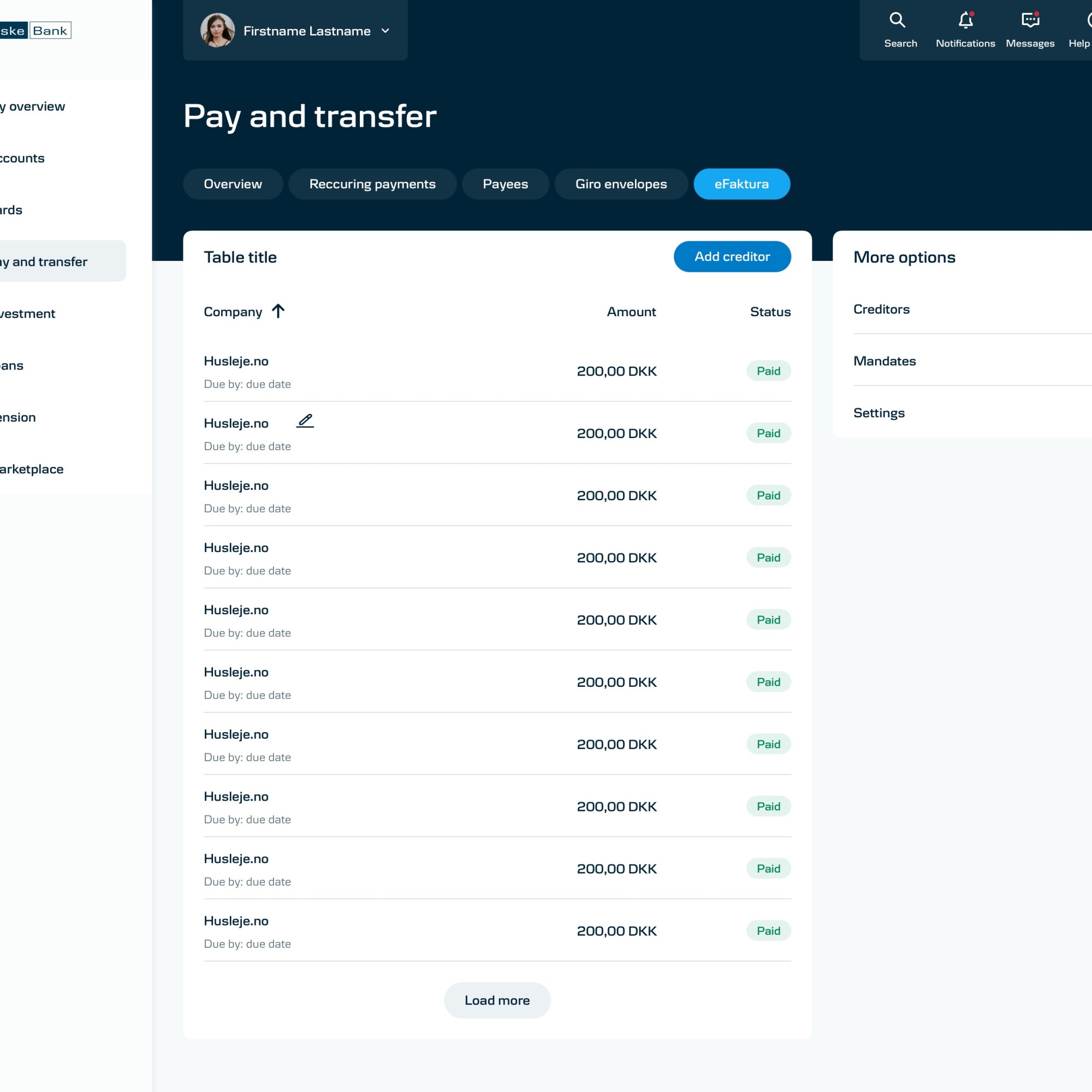
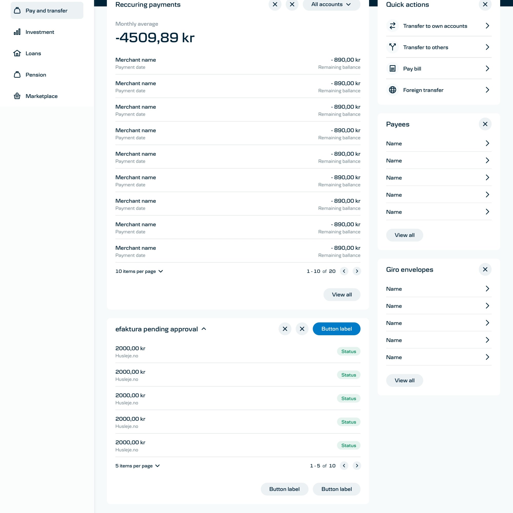
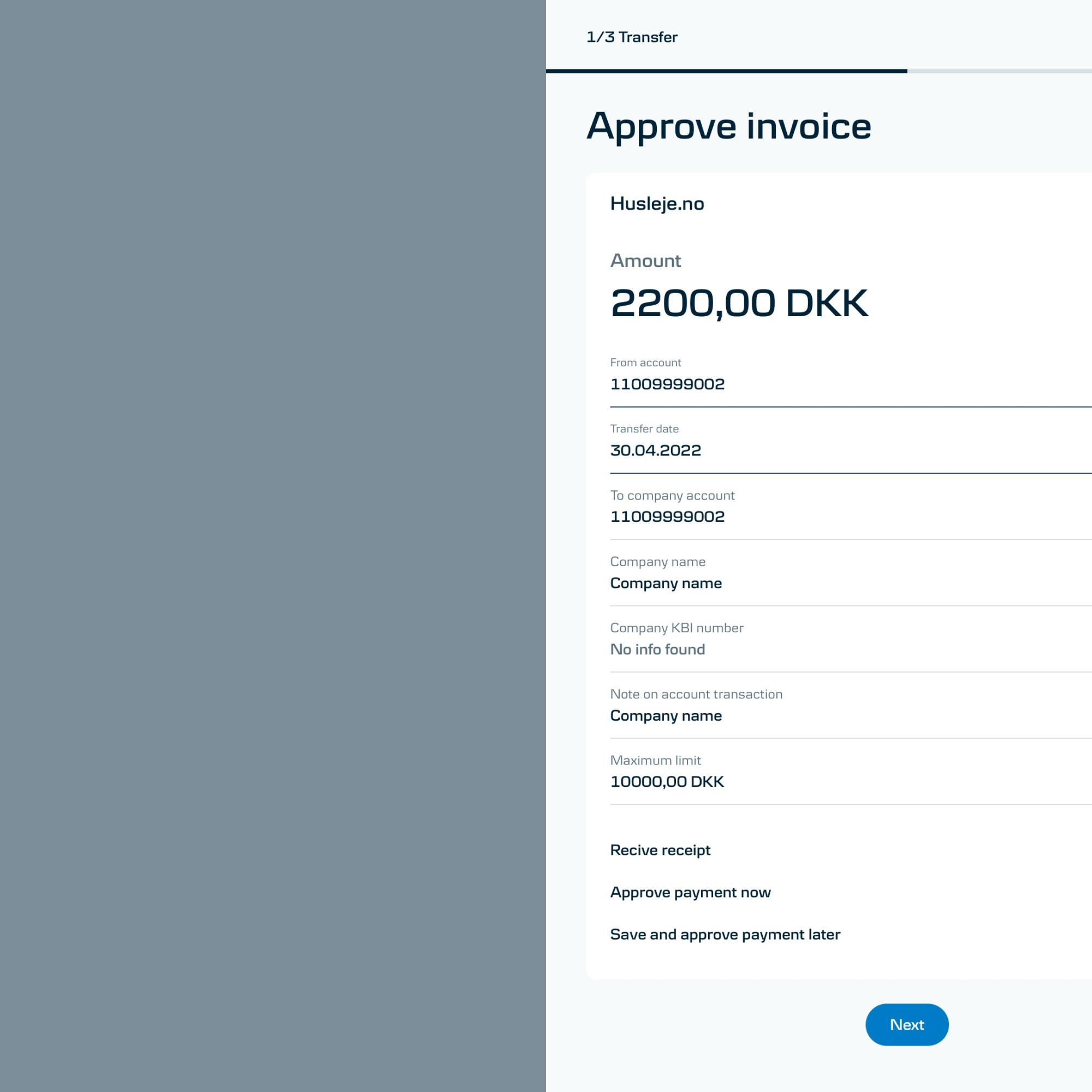
Dashboard versions
Persona tailored setups
The different personas have different needs and expectations.
Without a clear strategy on the direction from the business side I had to kickstart this part of the project based on assumption.
Trying to come up with the most feasible solutions I have mapped out each persona’s need and tried creating commonalities, but at the same time cater for each of them.
I believe that the suer should feel like the product is fully theirs, for their needs and their goals. Therefor I suggested we look into each version that would be ideal – with the data we have – for each persona.
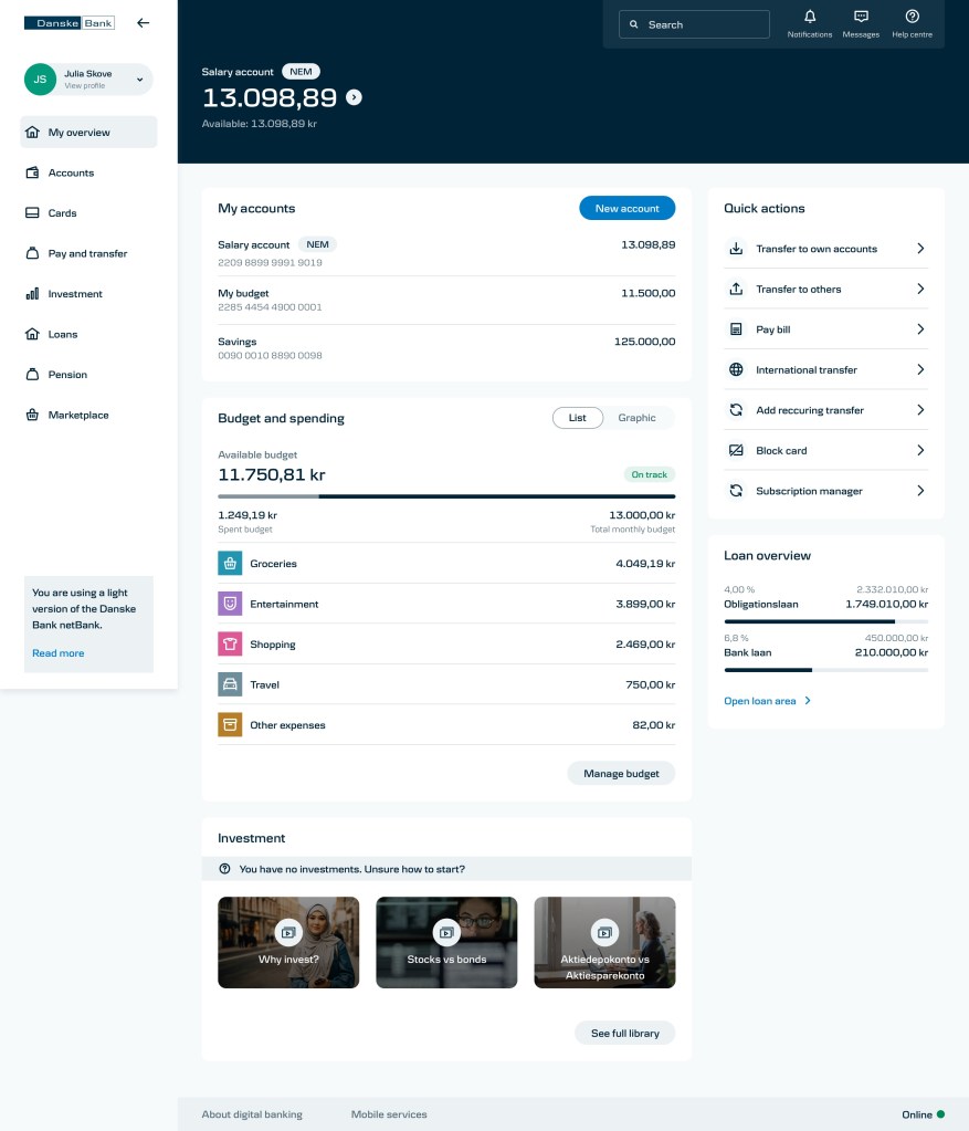
Inexperienced risk taker 27 y.o 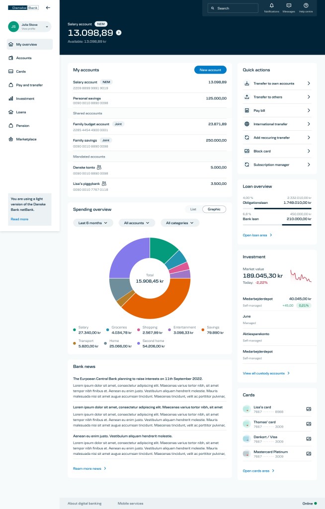
Pragmatic and trustful 38 y.o 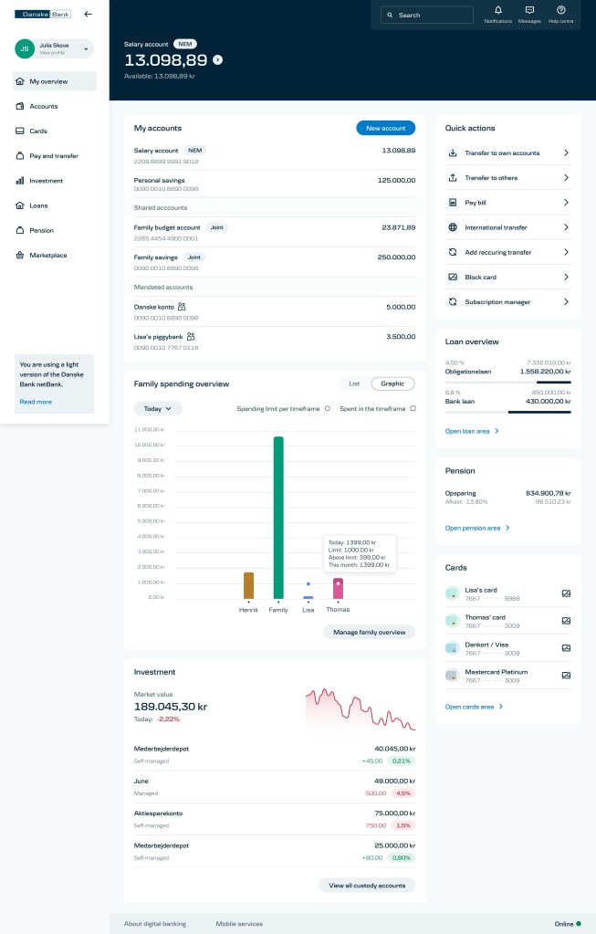
Skeptical and distrustful 42 y/o 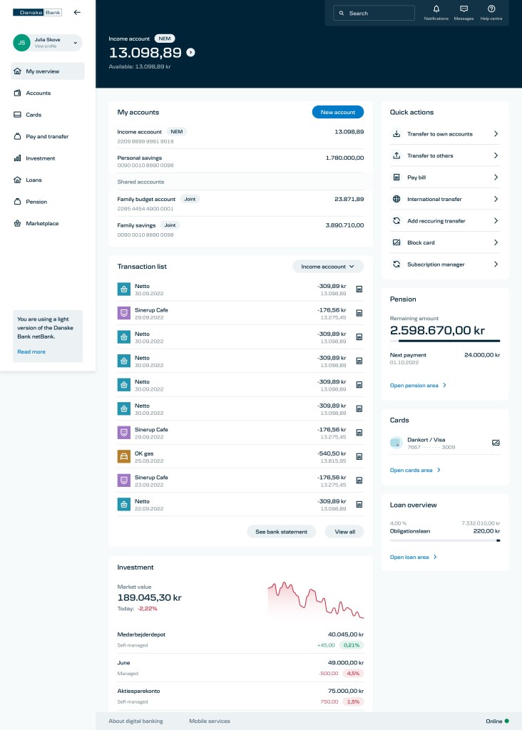
Traditionalist 59 y/o


